TEMPUS
An app for time-travel FOR GOOGLE
————
app/product design
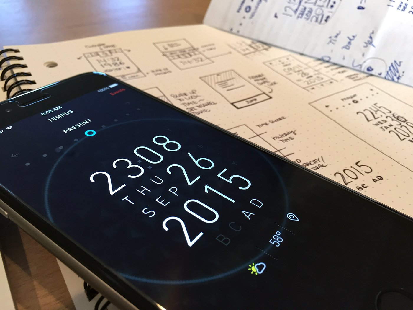
How important was it to re-educate the user? Was it necessary for me to craft a user interface that would lend itself to some overly designed futuristic dashboard with metrics/data that only a computer would find useful? Then it happened. I thought to myself, ‘Why not give the user an experience they’re used to?’ Put a clock in their face. Allow the user to do precisely what the technology would afford them: manipulate time.

Upon opening the app, the user sees the current time, day, year and month. The user then has the ability to manipulate their current point in time by tapping and holding a specific area. While holding down, the user has the ability to move their finger vertically in order to scroll quickly through a list of times, dates, days, and months depending on the area of interaction. When the user has set their destination in time, the reference wheel at the top changes to reflect the time set: (Future, 2 hundred years) along with the shifting of the current time marker in relationship to the set destination in time. The ‘Lift to Lock’ tab automatically slides up from the bottom only after the current point in time has been manipulated. The user is then able to lock the designated point in time by sliding the tab upward. The lift/lock prevents any accidental jumps from taking place and is a clear indicator of a future, major action. At this stage the user can no longer change any parts of their set destination and must abort in order return to the previous state.
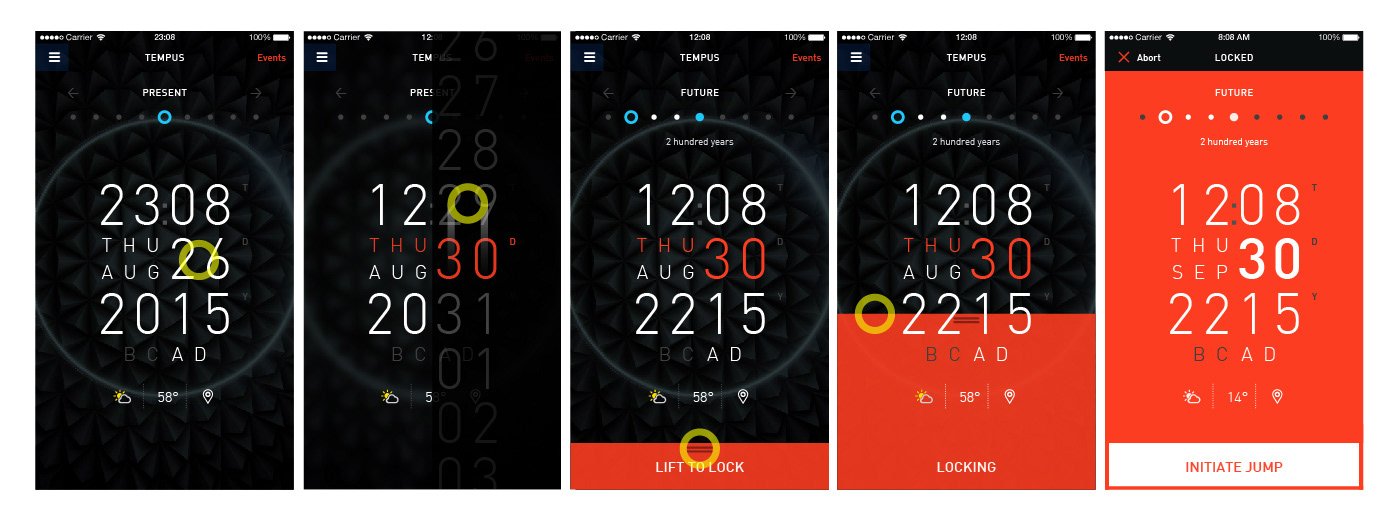
How do I show relationships in time? The issue with showing one point in time is losing the ability to directly reference the distance (in time) between two points (Current, Future or Past). What started as a calender tab/wheel at the top, gradually became a dot marker for measuring distance in between two points in time. Once the user begins to manipulate the clock, the horizontal point wheel (present) begins to shift from center to the left or right, indicating distance with color, shape, and label (future, past) with a small description. I began to shift the elements of time into a two column grid so that each variable could be manipulated using a vertical swipe. Both halves of each side would now be independently manipulated. Imagine how cumbersome it would be for the user to cycle through a massive vertical scroll for every year! By dividing the actionable area of the year into two parts, the user is easily able to ‘jump’ one year, or one hundred years into the future with a single swipe. The organization of the grid allows for swift interaction that would allow to the user to ‘jump’ in a hurry. Designing Tempus for the Android tablet gave me an opportunity to expand the Events area which is hidden in the iOS design. The Events panel displays a listing of key events that occur on that specific day. The user is able to tap a particular event in order to set their destination to travel to that specific time. This panel is especially crucial for determining if the user wants to travel to a certain point in time or avoid it all together. It serves as an aggregator of sorts for past and future events, giving the user the ability to refer to a timeline that they could potentially alter.
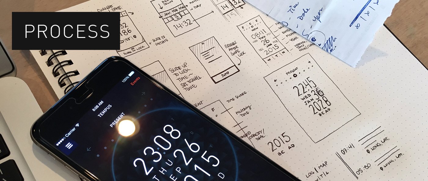
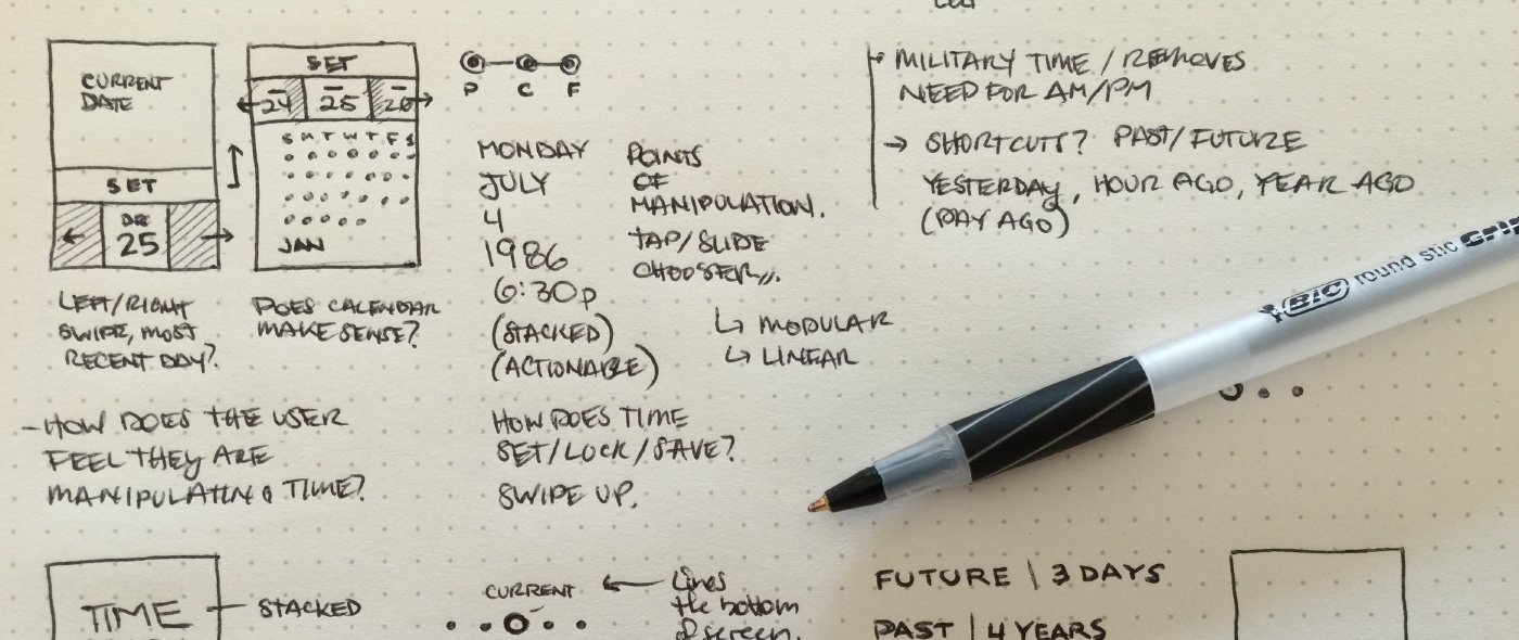
After a brief, yet fun-filled, brainstorm that involved wrapping my head around the possibility of time travel, I began to ask myself a few questions: As a time traveler, ‘What data/information would be necessary for my journey?’ I began to make a list of the necessary data. I would start with prioritizing the time, day of the week, day of the month, month and year. Everything else after that became secondary (weather, temperature, location and the events of that day in time). The objective was clear: the app (Tempus) should tell me where I am in time, and allow me to set a destination in time, future or past. How simple would it be for me to travel back 2000 years? Or 2 minutes? Interaction would need to be clear and intuitive.
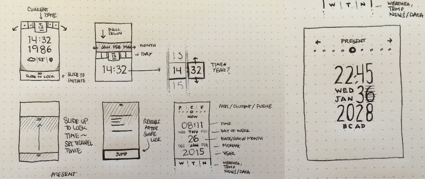
Manipulating time requires strategic actionable areas and intentional informational hierarchy. Inspired by basic calendar apps I originally planned a layout similar. Of course, that would mean exploring views that require a full calendar layout with the days of the week across the top. Not only would that take up too much space on the screen, it’d make for terribly tiny tap areas. My goal was to keep the user within one space, manipulating a single point in time. Would if I could set my destination in time just like I set an alarm clock? I would need to organize the elements of time in a way that made sense to the user and fit comfortably within the screen.
DESIGNS FEATURED IN
